MSI - Amazon Brand Store
Improving Sales by Visually Redesigning the Brand-Store Shopping Experience
Visual Design, Brand Marketing
Objective:
After observing the increased importance of brand presence in web channel markets as consumers adapt to shopping online, I initiated an effort to refresh the MSI Brand Store on Amazon. The goal was to improve sales by visually redesigning the brand store and to add recently introduced product categories.
Role:
Project Lead
Visual Designer
Process:
Comparative Analysis:
I worked with a channel marketer to perform a creative audit of the existing store design. We identified the store lacked compelling content, identifiable call-to-actions, and style/typographic consistency. Content also needed to be rearranged to accommodate for the inclusion of new product categories.
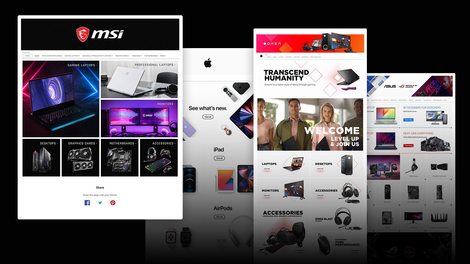
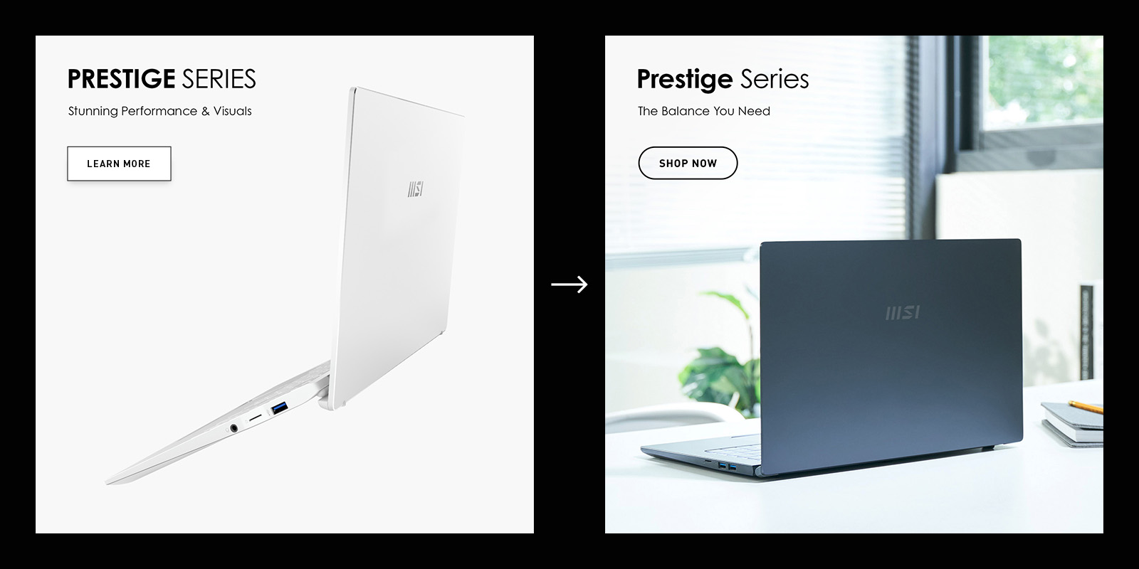
I examined competitor brand stores, noting successful uses of visual elements and multimedia to support brand messaging. The competitor's uses of UI button elements reached the user's traditional sense of clickable options, even if it wasn't the button itself that was clickable but the entire image panel. Consistent visual design created a more enjoyable, cohesive journey, but the most successful stores in this matter offered much less product variety.
From my evaluation of competitor stores, I established additional parameters for success: Create a compelling homepage experience, apply UI button elements, and balance visual consistency among a large assortment of products.
Slogan & Branding:
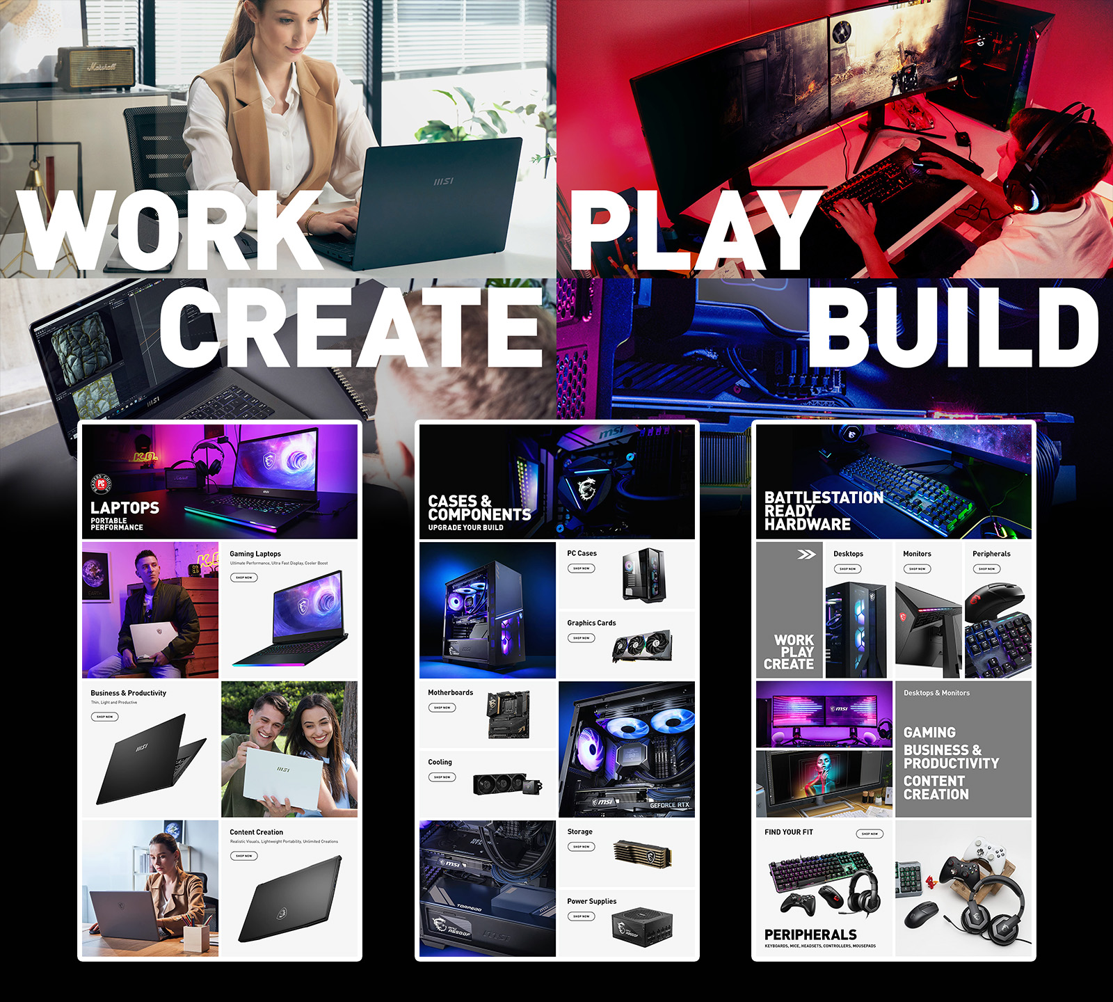
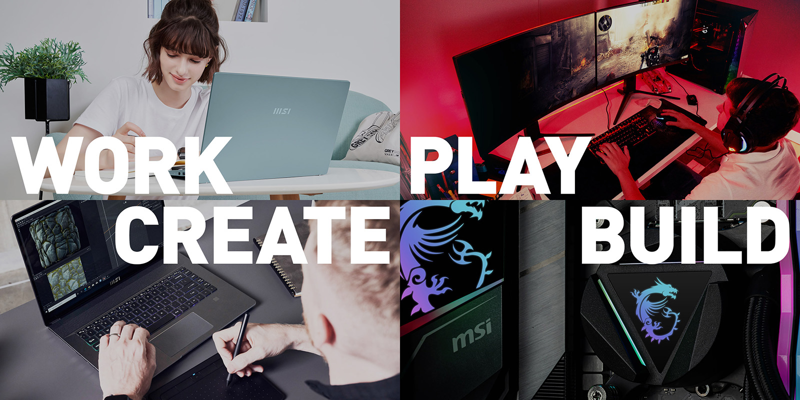
I revisited existing assets and referred to pre-established corporate style guides to determine the brand store's overall tone. I created the hero slogan "Work, Play, Create, Build" to establish an encompassing theme for MSI's various products.
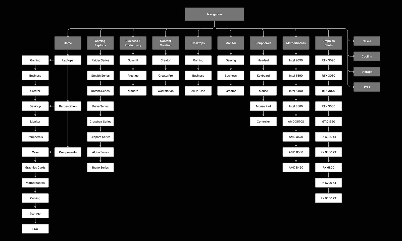
Information Architecture:
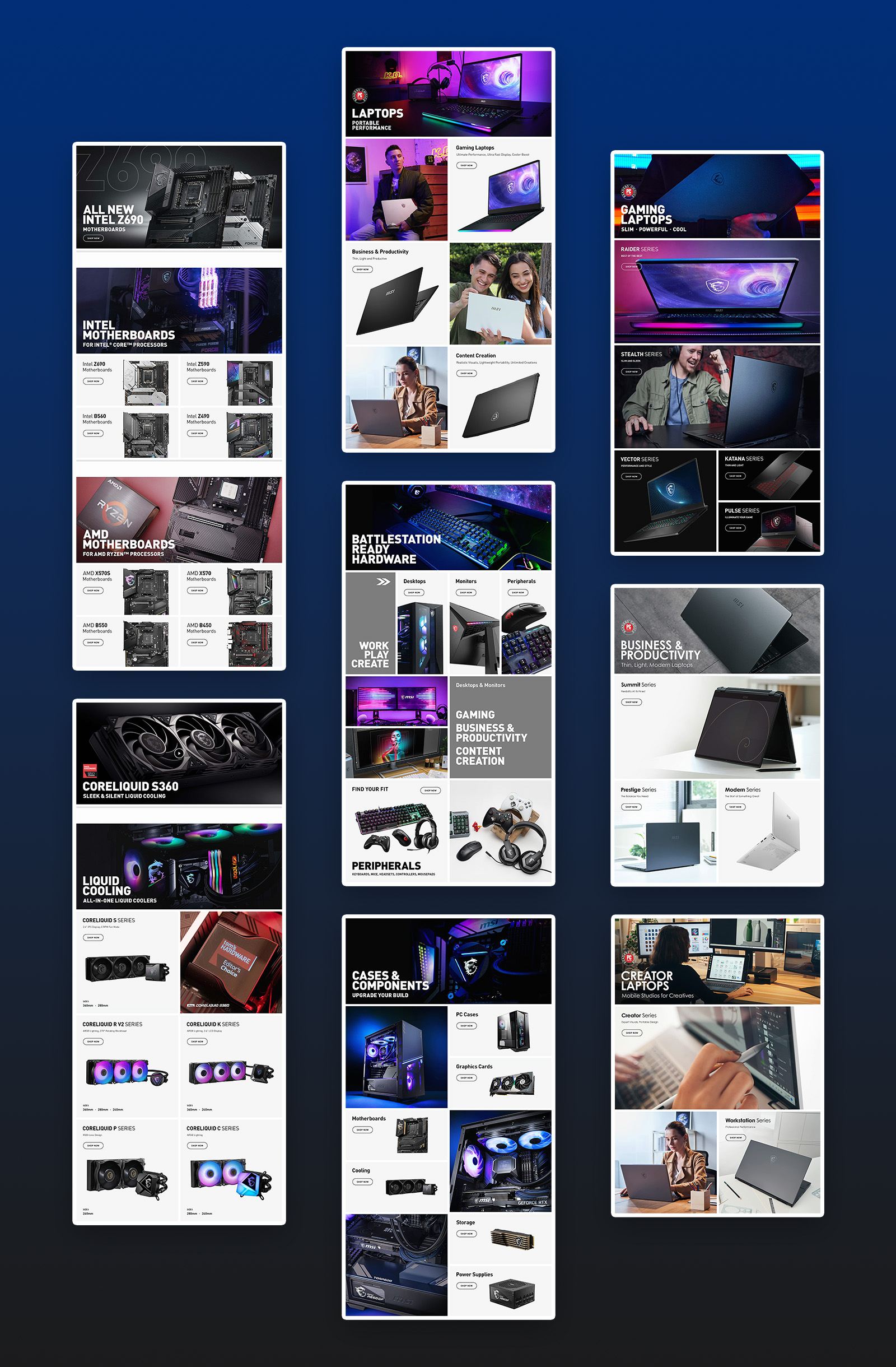
After compiling a list of product categories with the channel marketer, I created a site map to fit product category pages into the store's main navigation. The product category pages would serve as a briefly descriptive catalogue that covered each of their product series.
For the homepage, I needed to display all product categories in a simple layout with compelling visuals. After deliberating over the complete catalog of products, I decided to group them into three categories that range from broad market to technical market: Laptops, Desktop Hardware (Battlestations), and Components.
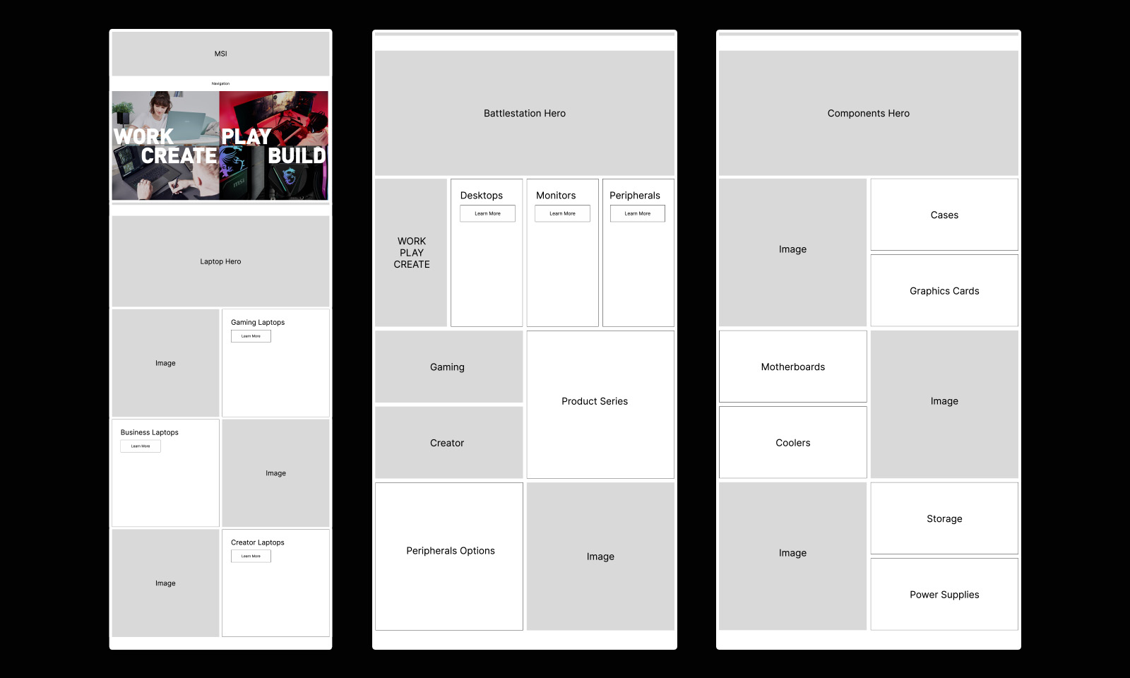
Low-Fidelity Wireframe:
Following the Information Architecture, I initially produced a low-fidelity wireframe to layout the homepage content. I explored the available layout options in the Amazon brand store editor and decided on simple formats that could balance compelling imagery with product category/series links.
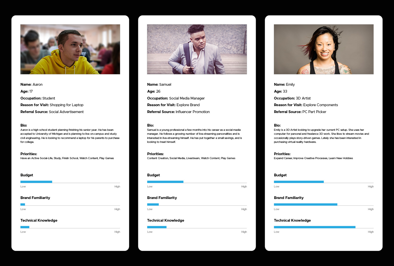
Consumer Personas:
With the wireframe decided, I created consumer personas to assist in creating marketing messaging for product groups. The personas reflected the consumers for each of the three product categories established in the information architecture.
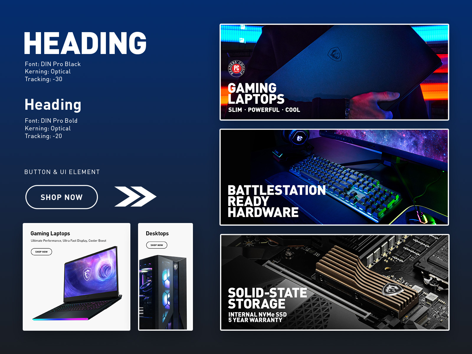
Visual Design & Copy:
When designing the store's visual aesthetic, I accommodated the pre-established fonts and colors listed in the corporate style guide. I explored the MSI's inventory of graphical assets and selected product photos that supported the marketing direction for consumer personas.
I chose lifestyle-focused imagery for laptops, "Battlestation" glamour shots for desktop hardware, and in-build contextual photos for components. When photos were not available, I design more graphical imagery using product renders. In addition, I wrote category descriptions that matched the brand's tech/gaming enthusiast tone.
Implementation & Iteration:
Using a rapid iteration approach, I worked with the channel marketer to launch the store's page redesigns as soon as they were ready. By monitoring the already-launched pages' metrics, I could decide how to iterate and improve their design and push those improvements into the next page redesign. We prioritized updating product pages based on demand and inventory while delaying other page updates to coordinate with new product releases, thus reducing work redundancy.
One iterative change made was an update to the UI button design. I opted for a thicker, rounder border to create greater contrast from the already rectangular grid layout. I removed the background and drop shadow which gave the button the flexibility to be placed on photographs.
Results:
With the rapid iteration approach, the brand store's homepage was the first to be updated. In the first month the page saw an +20% improvement in Orders/Views over the previous month. In 6 months, the page saw an average +60% improvement in Orders/Views per month YoY.
The redesign has served as a foundation for improving the brand messaging of other channels, such as Newegg. Even though the redesign was intended originally for just the US region, other MSI regional offices have adopted some of the designs for their own Amazon stores.